UI/UX
Prototyping
Wireframing
DESIGN SYSTEM
Usability testing
User research
design audit
design review
UJM
strategy
MARKET RESEARCH
TIMELINE
Jan 2022 — March 2022
PLARFORM
Android, iOS
context
CHALLENGE
1
2
3
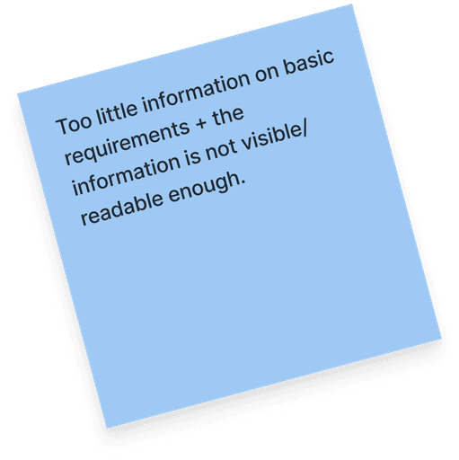
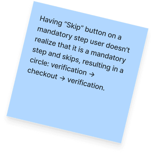
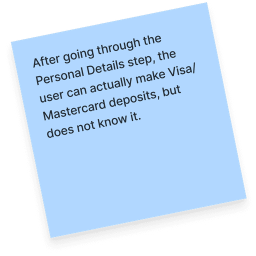
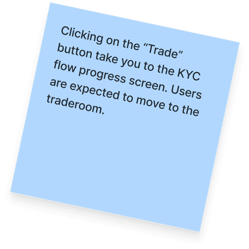
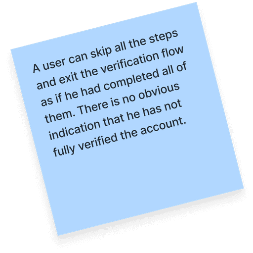
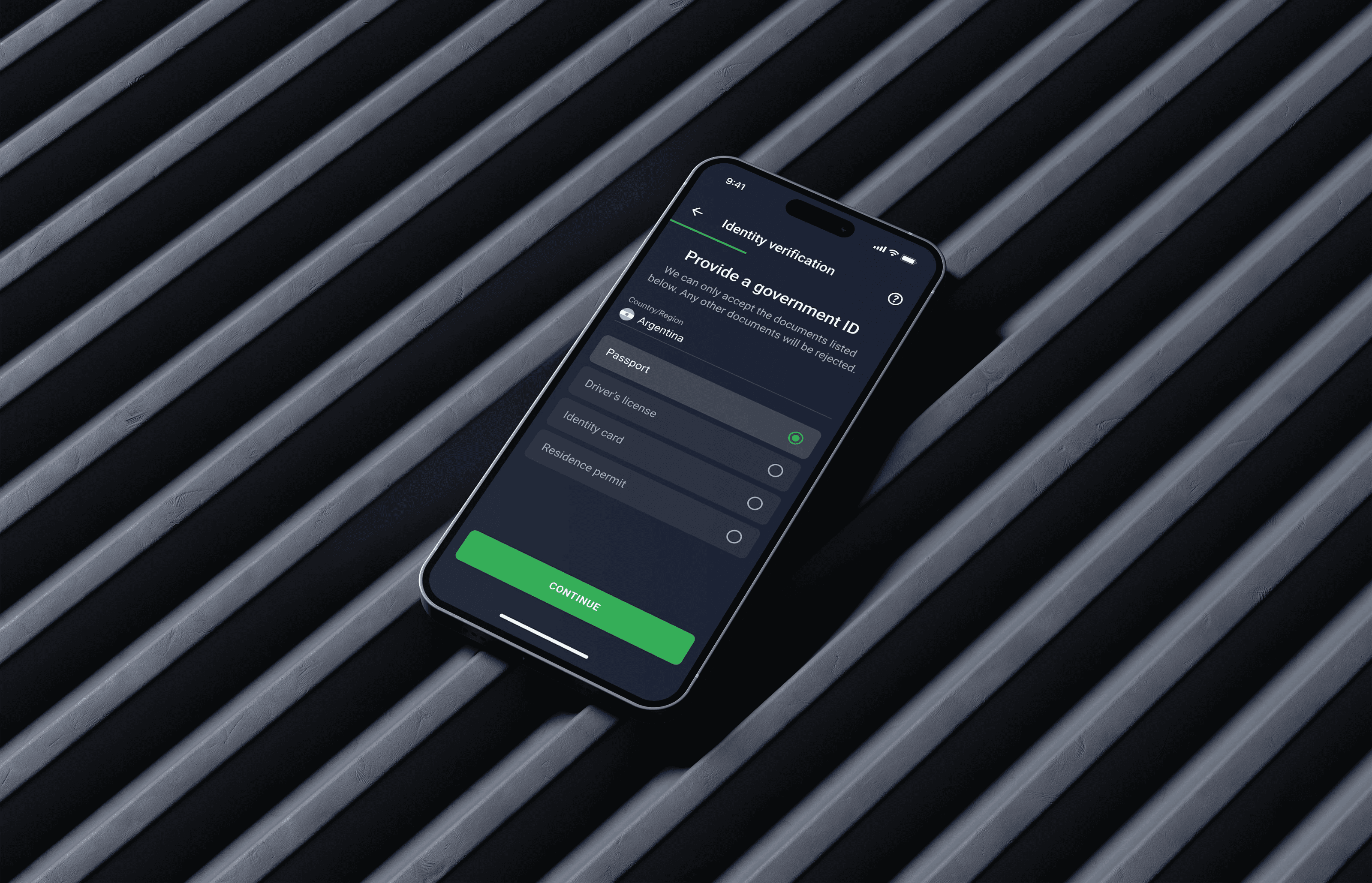
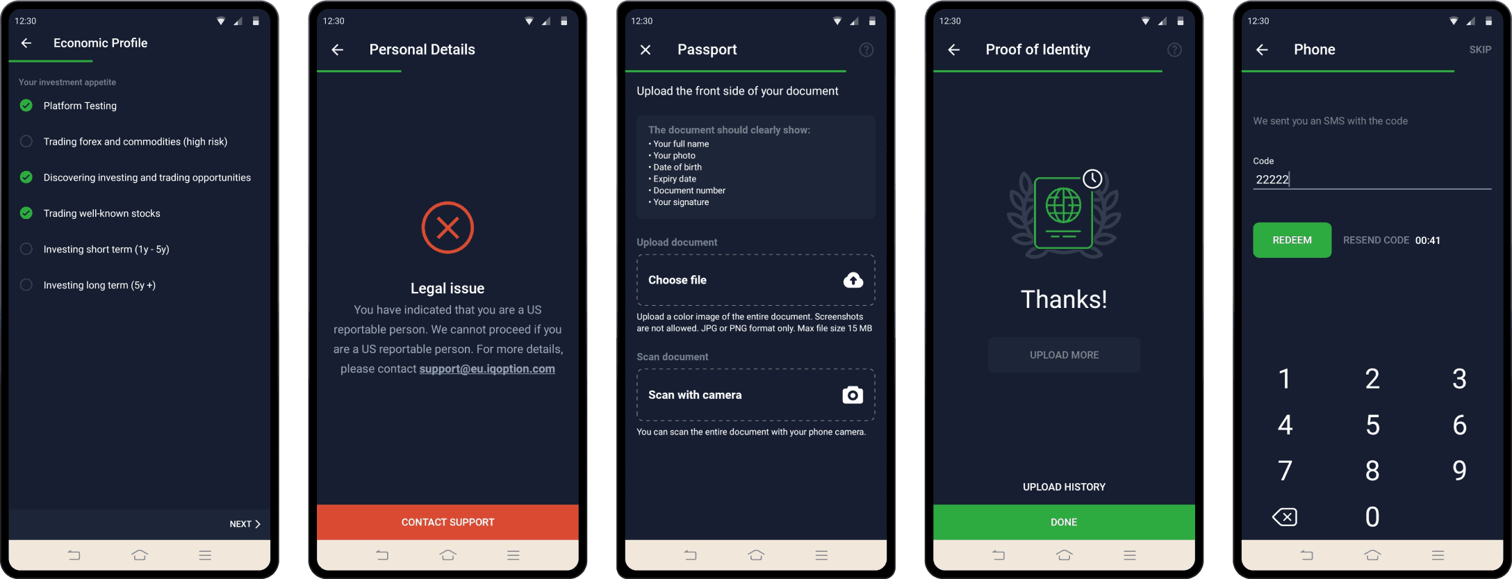
An example of what the different KYC screens looked like on the Android.
UI Improvements
(visual consistency)
Clear communication
(text revisions)
UX adjustments
iOS/Android
consistency
Navigation
(entry points)
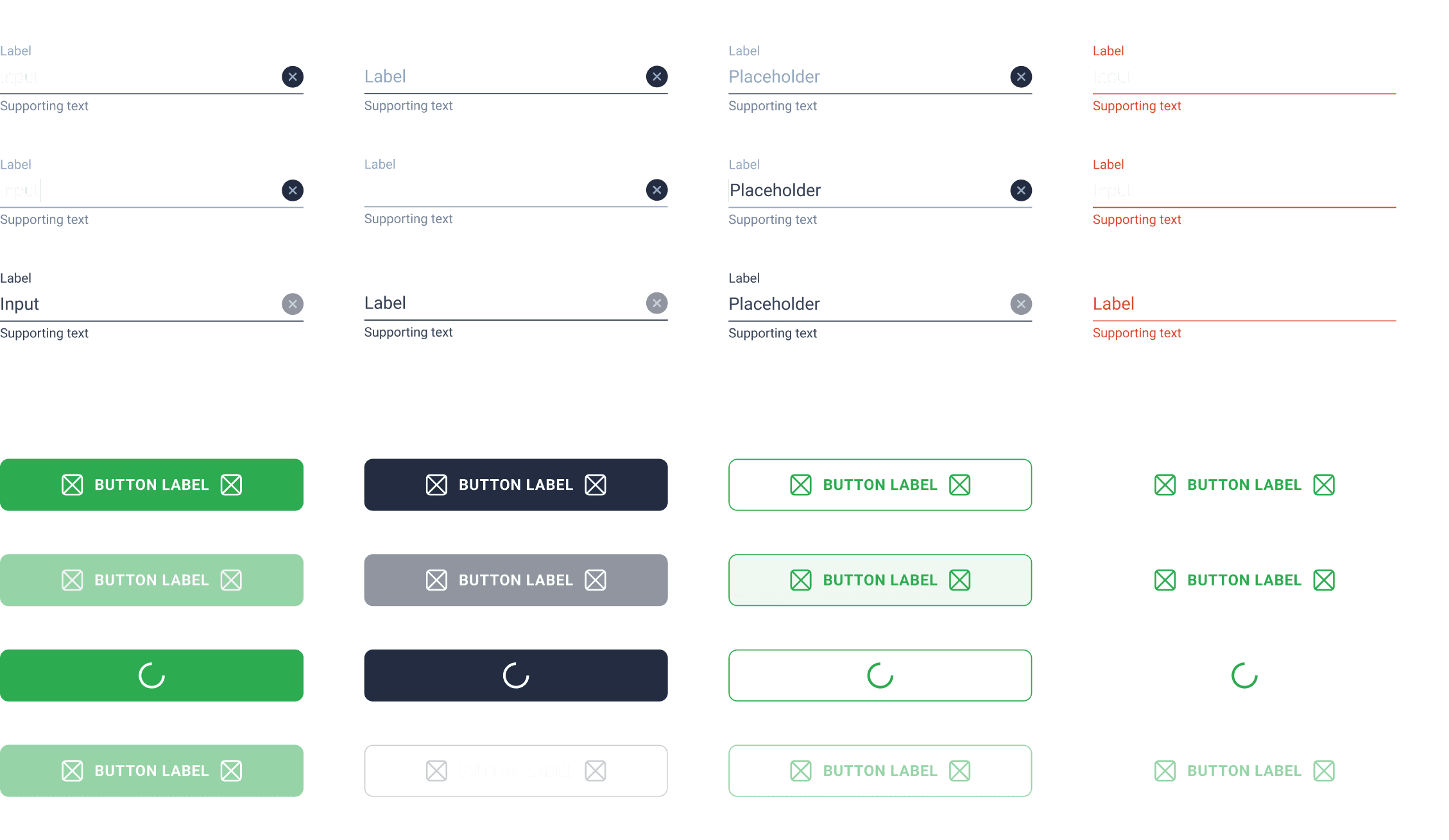
PART 1. UI Improvements
PART 2. text revisions
Clear communication.
We simultaneously worked on improving the texts, as there were numerous instances of poor communication where users could not understand what had happened. Let’s see some examples of improvements.
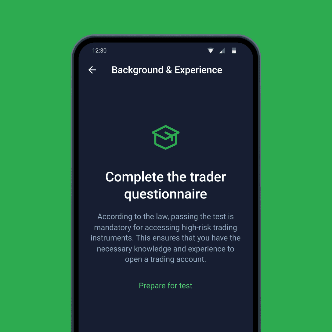
Introductory screens
Insight. Users do not understand why they need to complete certain verification steps.
Solution. I added intro screens explaining what needs to be done and why it is necessary.
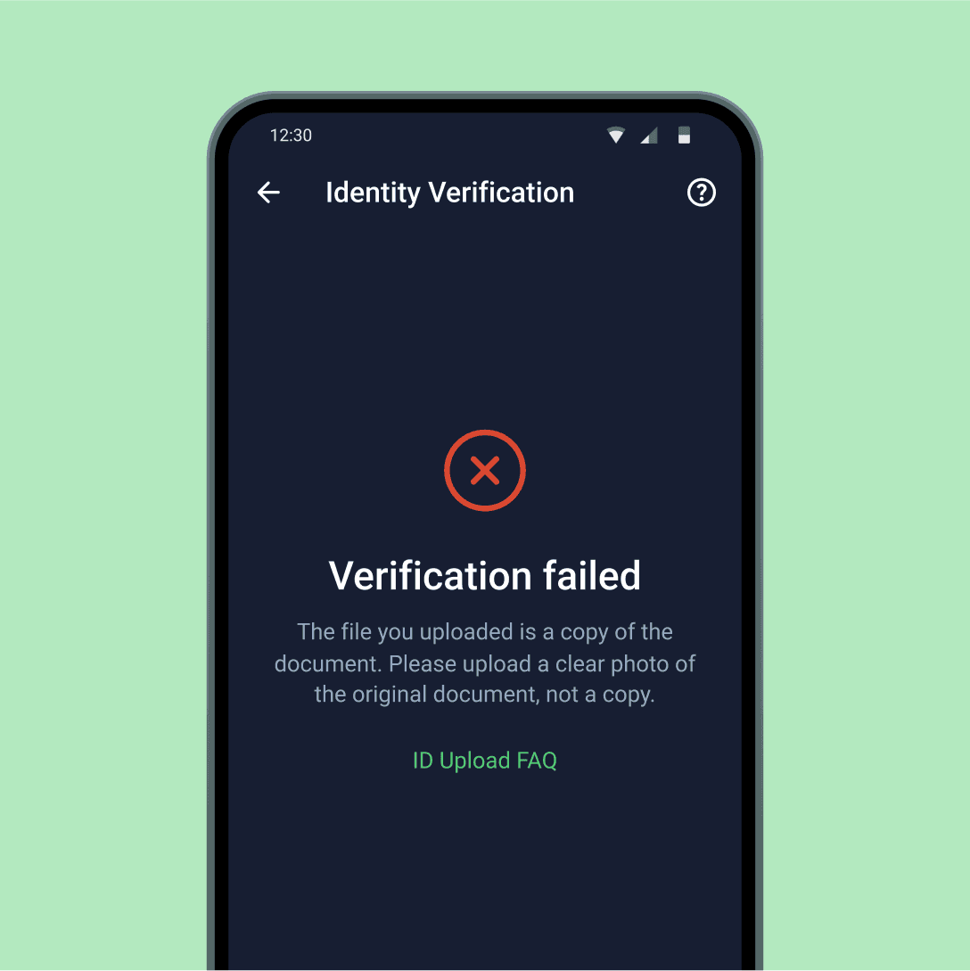
Clear reasons for rejection
Insight. Users find it difficult to understand the reason for document rejection.
Solution. We revised all rejection reason texts and added a link to the FAQ section.
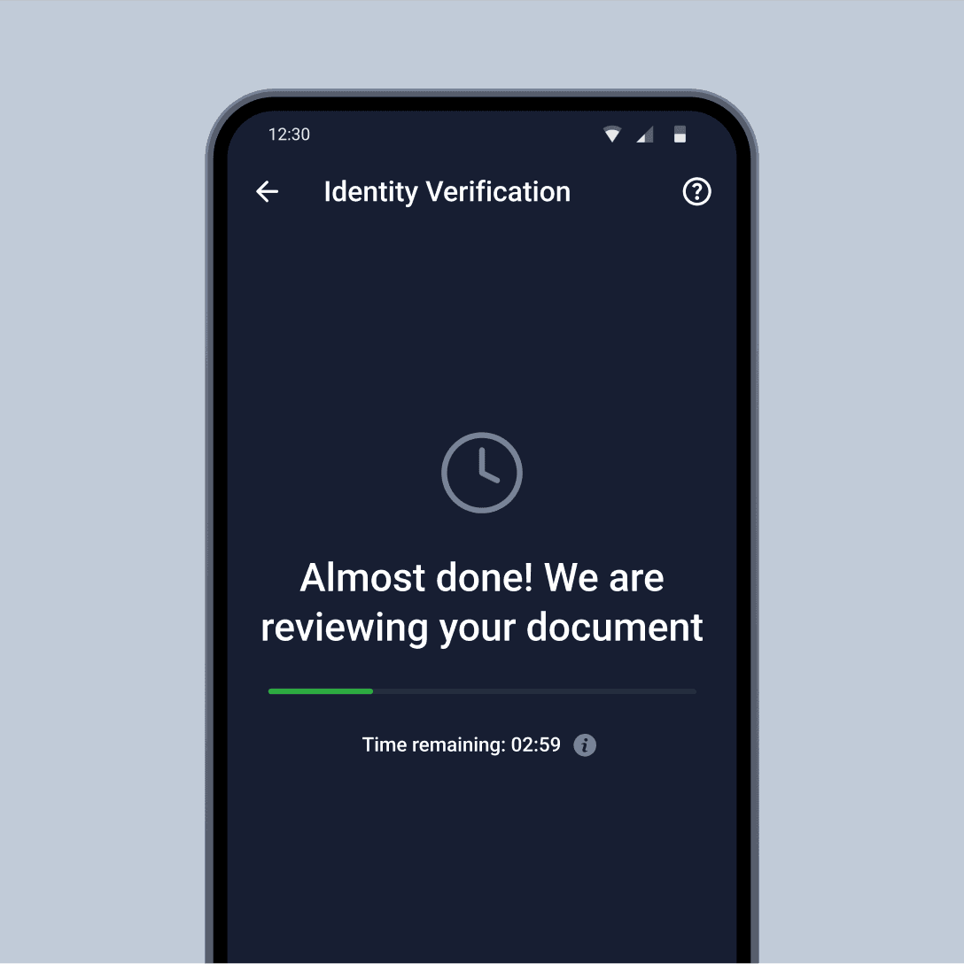
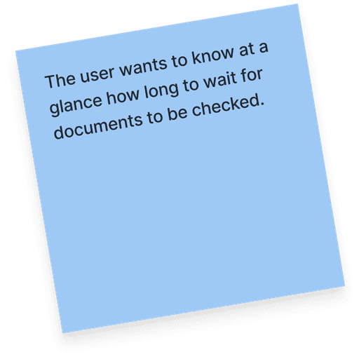
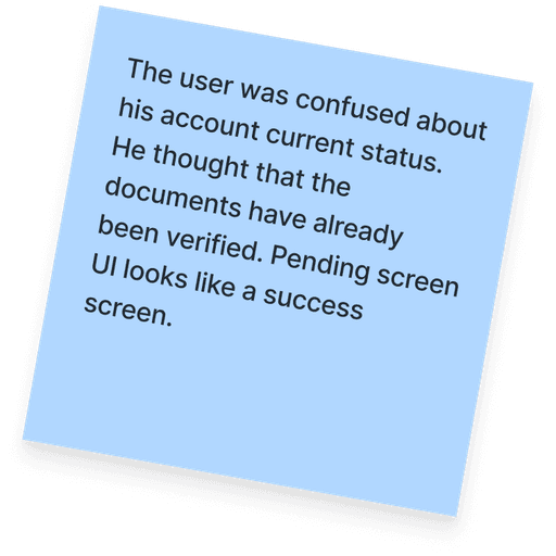
Review time transparency
Insight. Users do not understand that the document is under review and how long the review process will take.
Solution. We added a clear heading and icon and started displaying a timer with the estimated waiting time for each country individually.
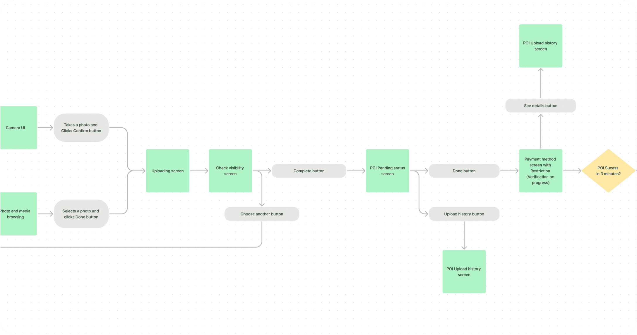
We made substantial progress in addressing our design debt by enhancing transparency in our communication, which significantly reduced the number of support inquiries.
PART 3. UX adjustments
Small details that matter
Improving the UX and small interactions in the questionnaire step was crucial for us because this step was particularly complex and lengthy in our KYC process.
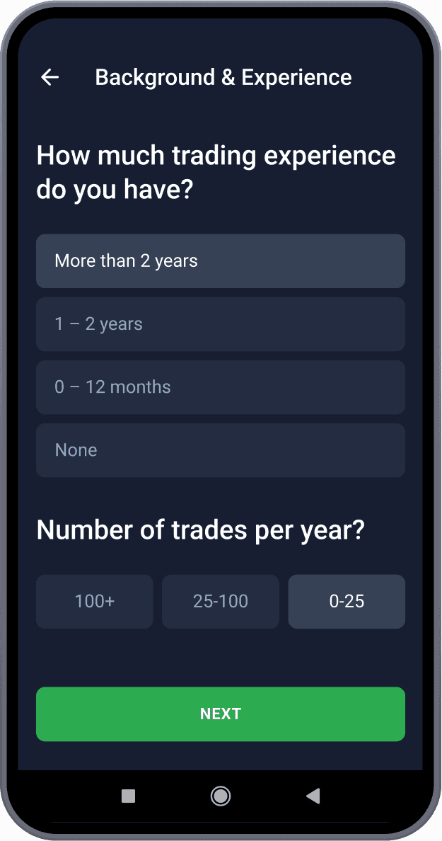
Combined questions
Merged related questions into a single screen to streamline the process.
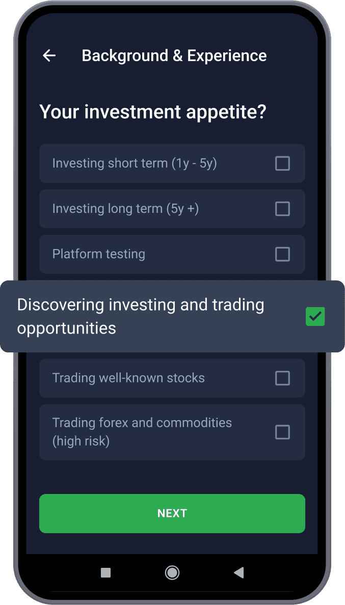
Enlarged tap zones
Increased the tap zones for answer options to improve usability.
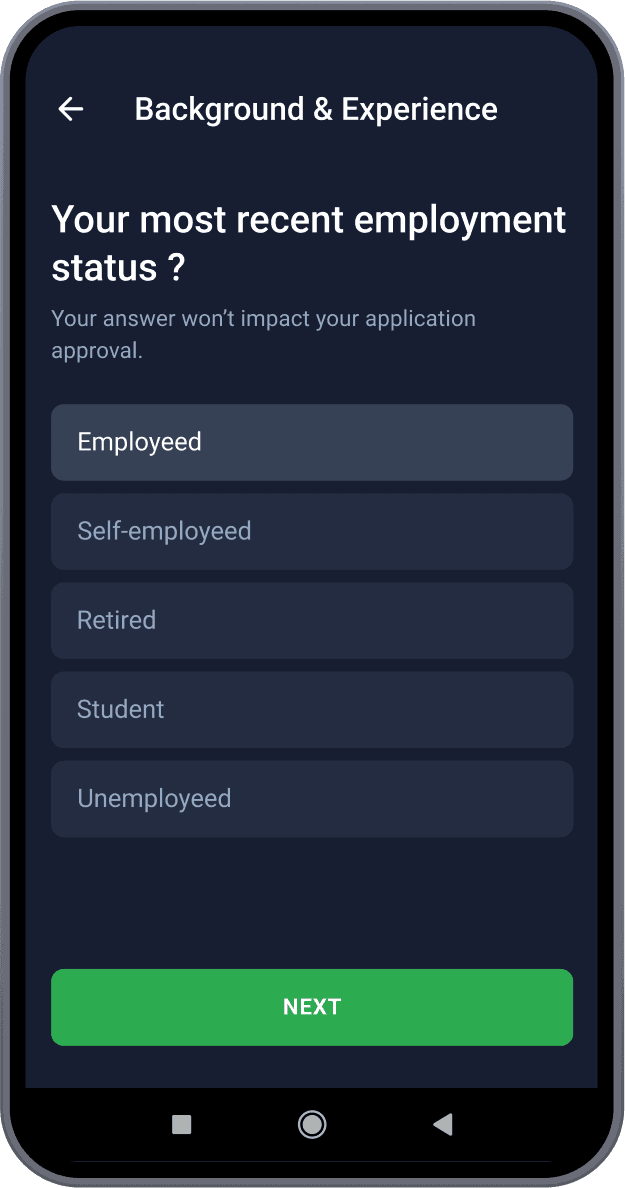
Additional explanations
Provided explanations where users feared answering or felt uncertain.
Questionnaire step completion time
reduced from 8 to 5 minutes.
PART 4. Navigation
From 5 clicks away,
to 1-click away.
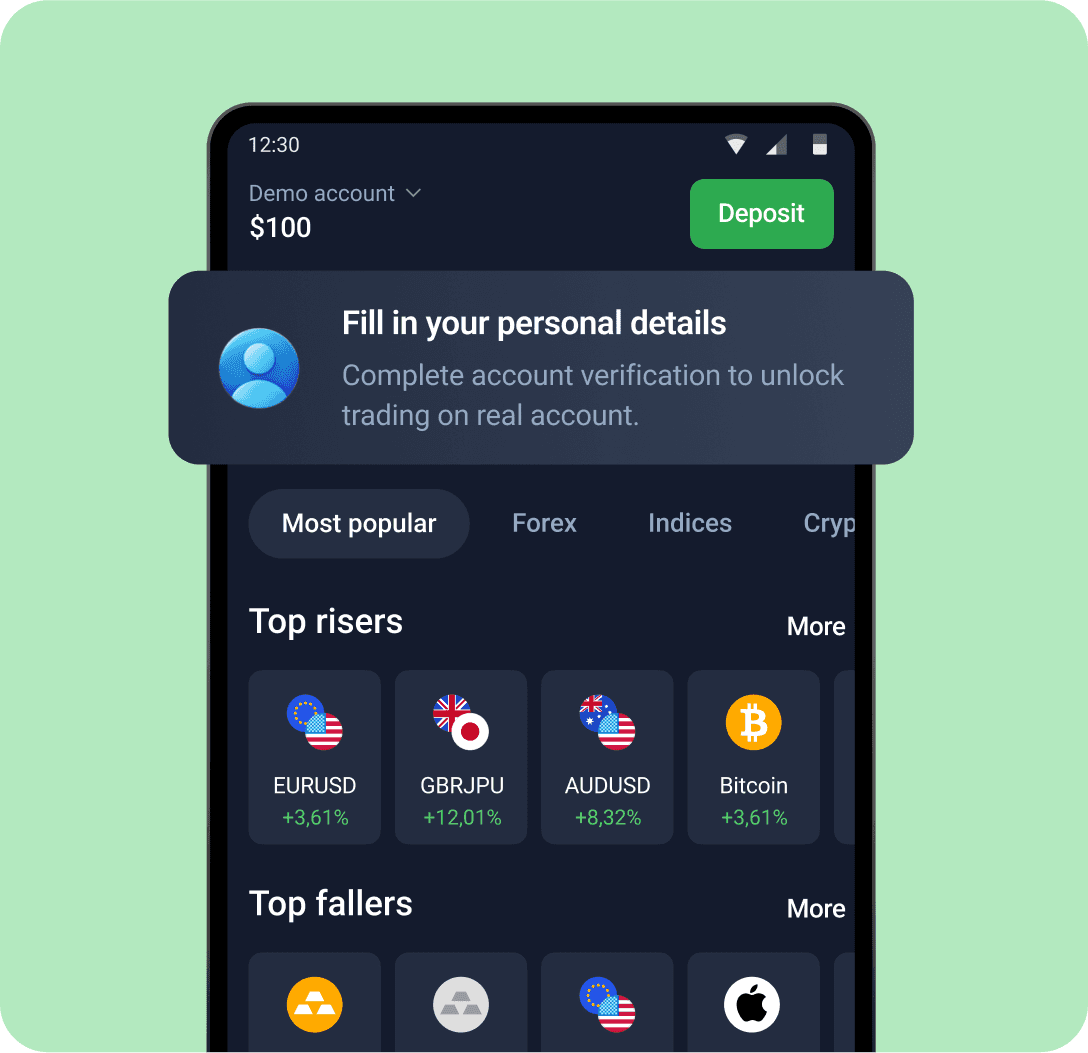
I added an entry point to the KYC flow on the start screen, allowing users to easily navigate to the required step.
This solution was implemented in regulated countries and improved the CR to Start Verification by 10%.
